Citi Bike
Languages and Tools
- JavaScript
- Vega
Teammate
- Job Lee
Duration
Live Demo
View Data Visualization Set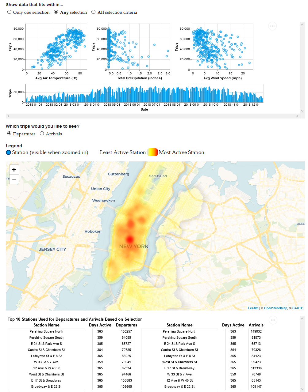
Overview
My teammate, Job Lee, and I were assigned to design a set of linked and interactive data visualizations. Its goal is to encourage domain experts to ask questions to help them solve their problems. Data visualization is simply a graphical representation of data, such as a bar chart or pie chart. We were intrigued by New York City's Citi Bike dataset, so we decided to design these visualizations to support city planners whose problems involve a bicycle sharing service.
Contributions
I was responsible for exploring datasets related to a bicycle sharing service, formulating questions, and creating visualizations using JavaScript and Vega, a visualization grammar in JSON format.
Challenge
Research Questions
Before we could create any visualizations, we needed to have a general idea of the types of questions they would address. The reason is because the visualizations should not answer any specific questions themselves, but allow city planners to ask questions, which may help them to solve their problems.
For example, these are the some of the questions we thought our visualizations would address:
- How does weather affect where Citi Bike users travel in New York City?
- Which days have more ridership? Why?
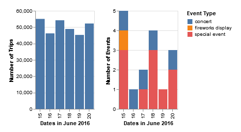
To formulate these questions, I explored the Citi Bike dataset by creating both static and interactive visualizations that answer some questions that I had. This involved any other compatible and useful data sets. For example, one of my questions was "How do events (sporting, concert, and special events contribute to bike usage?" I found out that events that take place in New York City did not contribute to bike usage because it was roughly the same amount when comparing two days that have five events and two events, respectively. The size of the events could have been an important factor, but it was not available. My exploration helped us understand that some questions were harder get a clear answer because the lack of data available.
Graphical Representation
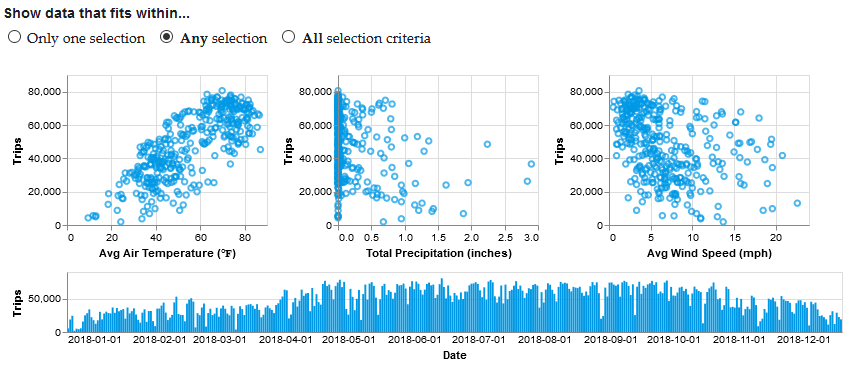
Based on those questions, we could figure out what types of data we wanted to visually represent and how. For example, since we wanted to know which days have more ridership, we would have to deal with quantitative data, specifically, the number of trips per day. From my exploration, I found that the bar chart was appropriate because it allows the viewer to easily compare the bar's height for each day. This same thought process is repeated for the other diagrams.
Interaction
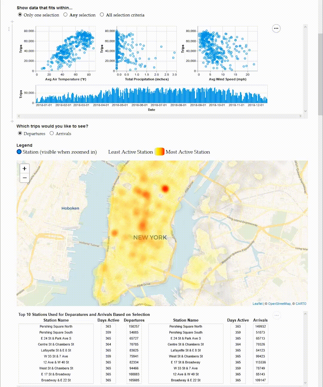
Interaction is typically added to data visualizations when the scale is too much for a static version to clearly represent the data. It enables users to explore and learn more about the data. For this set of visualizations, we chose to incorporate brushing because it was effective in highlighting the data in the scatter plot and bar chart to get a closer look. Whatever was highlighted can also be associated with the other diagrams. For example, when the bar chart is brushed to highlight a specific time frame, the scatter plots and map will update to highlight the trips taken and activeness of stations.
Reflection
In the end, we created a set of linked and brushable data visualizations with scatter plots, a bar chart, map and table which represented New York City's Citi Bike and weather data. Our feasibility pilot conducted with someone who works in city planning showed that "it could be useful for Citi Bike planners in determining where they may want to put more stations, or where they may want to increase/decrease their rates depending on the weather, for example."
Next time, I would add more information to the map so that the tooltip for every station would show the number of departures and arrivals. Also, add points of interests and public transportation routes to the map so that it could help understand why some stations are still active under certain weather conditions while others see minimal usage.
I learned that cleaning and trimming data sets are very important because it improves the performance of data visualizations and makes the creation of them more manageable. This is because only the relevant data points are kept.
I will continue to remember the importance of colour choice in data visualization, especially for gradients, so that the colours have a direct connection with the data that is being represented. This means that I would not use a rainbow gradient show visualize data unless it makes sense.